I hate articles that start off with a Definition of something .
So, I will start with a really bland one, whilst defining the concept of Design does everything to make something that can be so complex , so very mundane.
a drawing or set of drawings showing how a building or product is to be made and how it will work and look
Cambridge Dictionary
It pervades nearly all aspects of our lives. It is most certainly pertinent in everything we buy, whether goods or services.
What makes good design ?
What does “good” design look like and are there any instructions on how to create it? Dieter Rams, legendary industrial designer, who’s “less but better” approach inspired a generation of products, is famed for writing the Ten Principles of Good design.– www.designmuseum.org
Good design is innovative
Good design makes a product useful
Good design is aesthetic
Good design makes a product understandable
Good design is unobtrusive
Good design is honest
Good design is long-lasting
Good design is thorough down to the last detail
Good design is environmentally-friendly
Good design is as little design as possible
In the most part, this relates as well to a Service as to a Product.
Before we go any further lest not foget the wheel. 5,500 years and still going strong. I propose that there has been no better designed product. It has impacted upon every aspect of life and will continue to do so, in some form of other, for a long time to come . Nothing comes close in terms of design.
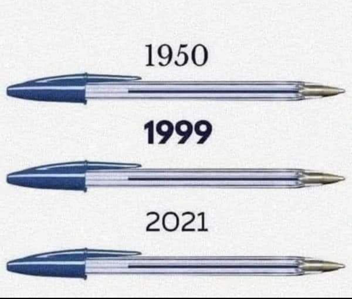
One simple product that I believe hits the mark on every count and illustrates the power of simplicity, usefulness, honest and long lasting is Laszlo Biro’s Ball point pen.
I can only think of one significant change in design and is when they put a hole in the top cap , to prevent small children (or big ones) from choking if they sucked on it and got stuck in the throat. Yes, very much a secondary use was the thinking process that was created when sucking on the top of Biro!
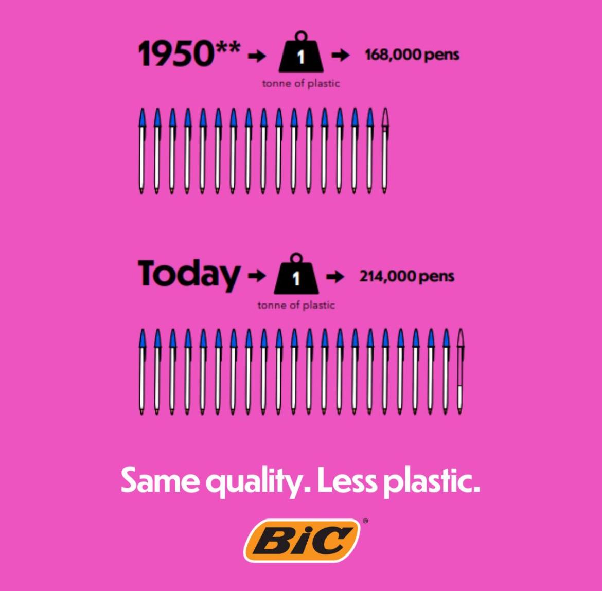
I stand correct on this as they have also managed to reduce the amount of plastic without impacting on design and use. See below:
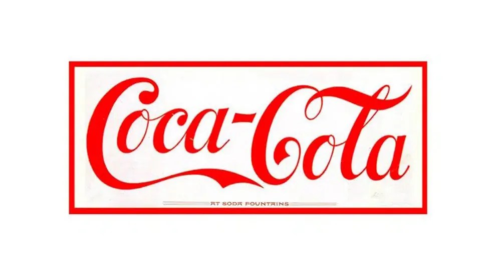
I cannot come up with any equivalent low priced, effective succesful product which has been designed and as little changed over 75 years. There are many, however, corporate ‘designs’ that have stood the test of time with only subtle changes.
1891
2024
1908
2024
Clearly both of the above have changed but it has been very slow and evolutionary such as the principles of the original remain and as a generation of consumer grows that little bit older it can still connect to the brand.
Occasionally good product design can create a demand for a product that nobody really knew existed.
For me there is one stand out product of modern times. The process began with the Company name … Apple. At the time most other Computer Manufacturers had imposing names like IBM, ICL, Hitachi,NCL, NEC and Microsoft. Steve Jobs (nobody is absolutely sure why) plumbed for Apple. The machines looked different and they were the first with a graphical interface as opposed that of other systems using text. Their initial success was soon engulfed by the mass success of the licensing and creation of Microsoft and its use in most PCs worlwide whereas Apple software would work only on Apple machines,and somewhat ironically focused on the niche market of Designers. Having left and being brought back into the struggling company Steve Jobs did, what the market considered slightly bonkers, develop a product away from computers. First came the ipod, which was not only a stunning looking product but immensely practical because of its capabilities. In 2007 the first Iphone was launched to much acclaim for the way it looked but was crictised as many asked Whats the point of it?
Apple Inc created and designed The Point of it . Apple led and the rest has followed. They designed and created and product then designed and created a need for that product . Others followed . We are now at a point where in the developed market it has become a virtual essential to have a smart phone of one sort or another. Try and park your car without a smart phone . Try and book a Doctor’s appoinment with a smart phone. On a recent holiday in Italy, we went out on the first night for a meal, leaving our phones in the hotel as were on holiday, and on asking for a menu , being told to scan the QR code on the table . We didn’t do that again.
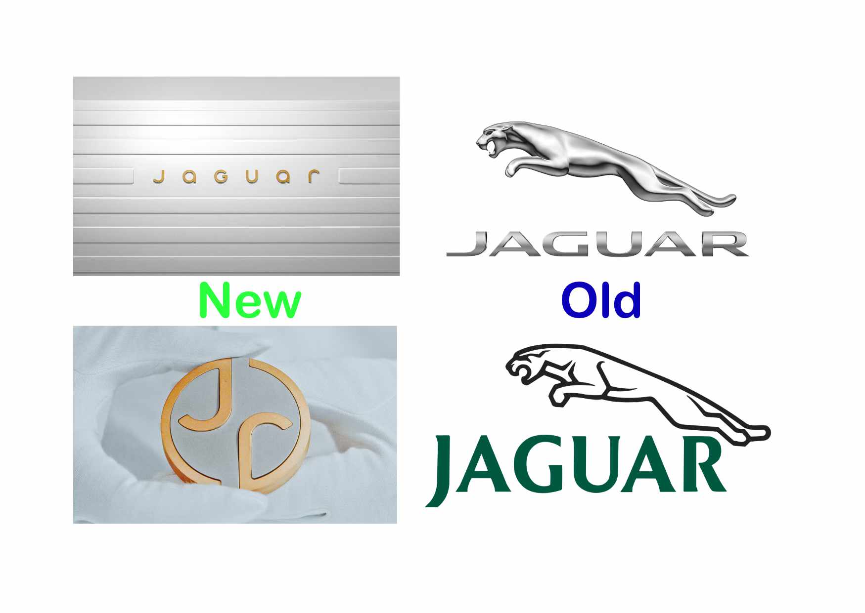
Poor Design?
Very recently Jaguar (UK manufacturer -Indian owned -Car maker) redisgned their logo. It has been treated mainly with derision . The accompanying ad has no mention of cars. Elon Musk -New Leader of the Free World – or at very least the bit of the free world that is completely bonkers – says (and I quote)
Do Jaguar make cars ?
Well, the proof of the pudding (as we say in English) will be in the eating . That said it has created an awful lot of publicity and it is very likley that someone like Elon Musk would not have even noticed the development without the controversial reviews.
You decide !
More Bad Logo Designs
The difference between Good or Bad in design , is subject to very fine margins. Ultimately, the judgement is made on how well a product or service performs. But it is not always true. Julia has a friend who often asks her what she thinks of the design of a new product she maybe launching . If Julia doesn’t like it then her friend knows it will sell . Well, some may say that Julia has no taste. To some that maybe very true, though they would be very brave to say that to her face. I would not say that. And that is not because I am worried about being smacked in the chops. It is because she has a very succesful background as a Designer .
“Design is so simple. That’s why it is so complicated.” – Paul Rand (American Desinger who specialized in logos eg IBM & UPS in the 1950’s & 60’s )
In 1996, The architects of a new Building for Salford University (Manchester UK) received the Stirling Award for Architecture (supposedly the most prestigious architectural award in the UK ). For the last 9 years it has remained empty because it is unuseable. Bad ventilation , heating system that did not work, no kitchens or social spaces …..to paraphrase
In short, it was a triumph of architectural gloss-glass, metal and concrete -over function -Richard Morrison -The Times November 29 2024
Salford Council now wants to demolish the building to build 900 homes and the Architects are furious and are objecting. They base theri argument on…
‘Ageing infrastructure is not a justification for demolition….’
It looked good but it was all form and no function .
In 1997 (clearly a bit of an iffy period in British Design) British Airways launched a newly design tail fin representing art and design from cultures world wide . The aim was to apeal to a market World wide . The, then, Prime Minister , Margaret Thatcher , when shown a model, dropped tissue paper over the tail fin. The designs were all removed in 2001 .
Several years ago a competitor of ours, launched a range of product, of which both Julia and I thought the design was really naff. We were wrong . Very Wrong. It turned out be a huge seller. Not only that, it was a product from a US company and they only sold it in the UK , making it unavailable in the US . Then they discovered that certain UK dealers were selling it on Amazon US with such a success that they made it available in North America.
Getting Design right should be a simple process. Well it is not . All the boxes maybe ticked, focus groups created, market research completed , but if launched and the customer don’t like it . The design ain’t no good . Design can be so simple, it is so important , it is very difficult ….For inspiration look at Bic and Apple . James Dyson (Dyson Vacuum cleaners) made 5,126 design changes over 4 years before his original idea worked. Even then he was rejected by many retailers. In 2023 the Turnover of Dyson was £7.1 billion . He got Design right. But nobody can tell him it was easy.